

Do Small Towns Provide Better Education? A UK Detective Story
The Mystery
I recently came across a fascinating article with dataset from the UK Office for National Statistics (ONS) asking:
Why do children in smaller towns do better academically than those in larger towns?
The data seemed clear: small towns consistently outperform large towns on education metrics. The ONS article explored various factors—coastal location, regional differences, university presence, income differences—but something felt incomplete. They’d identified a pattern but hadn’t answered the fundamental question: Why?
As someone learning causal inference, I wanted to dig deeper. What I found completely upended the conventional wisdom.
What the Data Shows (At First)
Looking at over 1,100 UK towns, the education attainment pattern is undeniable:
- Small towns: Score +0.30 above the national average
- Medium towns: Score -0.25 below average
- Large towns: Score -0.81 below average

Small towns win – on average they achieve better education attainment. Education attainment here is a composite index taking into account the same children’s key stage exam results through the ages of 11 to their degree programs (if they went to university) As noted, there are multiple reasons that explain factors that are related to the high-performing towns – correlations between town characteristics and education attainment.
The Income Question
However, there’s one correlation in the ONS article that caught my attention: small towns in the UK are dramatically wealthier than large towns.
When I broke down income deprivation by town size, the pattern was striking:

- Small towns: Only 36% of towns classified as ‘high-deprivation’ (small towns are predominantly wealthy)
- Large towns: 69% ‘high-deprivation’ (struggling)
The above disparity is particularly noteworthy because the income gap between ‘wealthy’ and ‘poor’ towns is absolutely massive.
Looking at average education scores by income level:
- Wealthy towns (low deprivation): +2.76 points
- Poor towns (high deprivation): -2.42 points
- Total gap: 5.18 points
To put this in perspective: this 5.18-point difference represents roughly two standard deviations—moving a child from the 50th percentile to the 85th percentile in income.
So we have to ask: Is the “small town advantage in education attainment” real, or is it just a wealth story in disguise?
Drawing the Causal Map
To answer this properly, I needed to map out how these factors actually cause each other, not just correlate. This is where causal diagrams come in—a powerful tool that makes your assumptions explicit and testable.
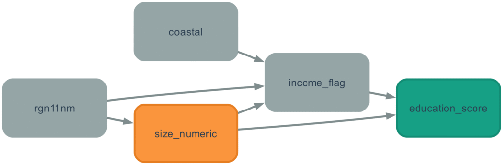
Here’s what I mapped out:
- Region ‘rgn11nm’ directly affects both town size AND income (some regions have larger towns, some have wealthier)
- Town size ‘size_numeric’ directly affects income levels and education (small towns tend to be wealthier, with better schools)
- Income ‘income_flag’ affects education outcomes (wealth provides massive advantages as we will see)
- Coastal location ‘coastal’ affects income (many coastal towns are economically struggling)
The critical insight: income sits between town size and education. It’s not just a side factor—it’s potentially the entire mechanism through which town size appears to matter.
The Analysis
Using causal inference methods (specifically the DoWhy Python library implementing Judea Pearl’s framework), I measured the effect of town size while properly accounting for confounding factors like region and coastal location.
First, the total effect: small towns score 0.62 points higher in education attainment than large towns on average (per size category: Small → Medium → Large).
But then I asked the crucial question: What happens if we compare towns with the same income level?
This is called mediation analysis—decomposing the total effect into:
- Direct effect: Does town size matter independently?
- Indirect effect: How much works through the income pathway?
And the results…
When comparing towns with equal income levels, large towns actually score 0.34 points HIGHER than small towns.
The effect completely reverses.
Here’s the full breakdown:
Total effect: -0.62 points (small towns appear better) Direct effect: +0.34 points (large towns actually better when income is equal!) Indirect effect through income: -0.96 points per size category
Multiply by 2 to get the full Small town → Large town effect:
- Total apparent advantage of small towns: 1.24 points
- Actually working through income: 1.92 points
- True effect of being small (when income is equal): -0.68 points (large towns better!)
Education Inequality: It’s all about Wealth
The “small town advantage” as noted by the ONS study, is entirely about wealth.
When you compare towns with similar income levels, large towns actually offer clear advantages:
- Better school resources and facilities
- Larger pools of qualified teachers
- More educational infrastructure
- Greater school choice and competition
- Economies of scale in education
But in the real world, these advantages are completely overwhelmed by a stark reality: large towns are much, much poorer than small towns.
Remember that 5.18-point gap between wealthy and poor towns? That’s the real story. Town size creates a 1.92-point education attainment difference purely through income sorting—wealthy people cluster in small towns, poor people cluster in large towns. The direct effect of town size itself is tiny (0.34 points) and actually favours large towns!
Income effects (shown in red in below graph) is massively more important than town size (shown in green in below graph), and works in the opposite direction. The overall effect is showing in navy blue in below graph which is the dampened effect found in the ONS article.

The Coastal Story
One fascinating detail emerged: the town size effect is three times stronger for coastal towns than inland towns.
- Coastal towns: -1.61 points per size category
- Non-coastal towns: -0.52 points per size category
Why? Large coastal towns in the UK are often declining seaside resorts facing severe economic challenges. Small coastal towns tend to be wealthy retirement communities. The income gap—and thus the education gap—is much wider in coastal areas. It’s another piece of evidence that this is fundamentally about economics, not community factors.
Why This Matters
For policymakers:
The conventional narrative is dangerous.
If you believe “small towns are better for education,” you might invest in promoting small-town values, community programs, or rural education initiatives.
This would miss the point entirely.
The real crisis is economic decline in large urban areas. Former industrial cities are struggling with poverty, unemployment, and deprivation—and this is devastating educational outcomes. The solution isn’t to make cities more like small towns. It’s to address urban poverty and economic decline head-on.
A 5.18-point income gap between wealthy and poor towns is a national crisis. It represents 10-15 percentage point differences in students achieving basic academic milestones. This has lifetime consequences for earnings, employment, and social mobility.
For parents:
The good news is simpler than you might think: find a wealthy area.
Whether it’s a small town or large city matters very little (0.34 points—barely noticeable). What matters enormously is the economic health of the community (5.18 points—life-changing).
If you can afford a nice neighborhood in a city, your kids will likely do just as well—or slightly better—than in a wealthy small town, with the added benefits of urban resources, diversity, and opportunities.
For researchers:
This is exactly why causal inference matters. The ONS article, while well-intentioned, identified a correlation but completely missed the mechanism.
They saw that small towns correlate with better education and asked “why are small towns better?”
The better question was: “Are small towns actually better, or are they just wealthier?”
Answer: They’re just wealthier.
Without causal analysis, you might invest years and millions of pounds addressing the wrong problem.
How I Did This (The Technical Part)
I used DoWhy, a Python library implementing Judea Pearl’s causal inference framework:
- Built a causal model (DAG) based on domain knowledge about how region, income, town size, and coastal location interact
- Identified confounders using the backdoor criterion—region and coastal location create spurious correlations that need to be controlled
- Estimated the total causal effect using backdoor adjustment—properly accounting for confounding while leaving mediators (income) unblocked
- Decomposed the effect using mediation analysis—controlling for income to separate direct effects from indirect effects through the income pathway
- Validated with sensitivity tests—all three tests passed, confirming the effects are robust
The analysis revealed something statistically fascinating: a suppression effect. Regional differences were actually hiding part of the true relationship, making the naive correlation weaker than the true causal effect. This is relatively rare and shows why proper causal modeling matters.
This analysis was conducted using publicly available data from the UK Office for National Statistics via TidyTuesday. The findings were validated using multiple sensitivity tests and are robust to various modeling assumptions. Full methodology and code available upon request.
Causal AI for Business: The Quiet Revolution Changing How Companies Think
Correlation does not equal causation…
Correlation does not equal causation…
Correlation does not equal causation…
Correlation does not equal causation…
Correlation does not equal causation…
You’ve probably heard this mantra in a statistics class—or seen it scrawled across a whiteboard somewhere. It’s a core principle of data science: just because two variables move together doesn’t mean one caused the other.
The classic example? Ice cream sales and shark attacks both rise in summer. But it’s not because sharks enjoy dessert—there’s a third variable: hot weather.
Everyone accepts this. Statisticians, analysts, even researchers in artificial intelligence.
But here’s the problem:
In business, we act as if correlation does imply causation.
And we do it every day.
This quiet contradiction sits at the heart of how modern companies use data—
and the Causal AI revolution is here to fix it.
Current Practice: How Businesses use Data Today
Let’s start by understanding the typical business data journey—from collection to decision-making.
Data is collected, often passively, through company operations: sales records, support tickets, customer interactions, and increasingly, product usage logs. These form the “data wells” that analysts draw from.
Then comes exploratory analysis. The business analyst examines trends, correlations, and anomalies. They look for patterns that might explain—or at least hint at—business outcomes. For example:
- If a customer complains and isn’t refunded within 7 days, there’s a 95% chance they won’t return.
- If a student stays up to date in weeks 1–6, there’s a 99% chance they’ll finish the course.
These are probabilistic associations, not causal claims. Analysts present them with careful language:
“There is insufficient evidence to confirm a statistically significant relationship…”
In short, the analyst remains a scientist. They stay true to the statistical mantra:
Correlation does not imply causation.
The Contradiction (or the Crime)
But here’s the contradiction—the crime hiding in plain sight.
It’s not the analyst who acts on the data. It’s the decision-maker—the head of operations, the marketing lead, the director. They’re the ones who must decide:
- Should we automate more refunds, based on that customer complaint correlation?
- Should we make Weeks 1–6 easier, hoping to increase course completion rates?
And in making those decisions, they often do what the analyst wouldn’t dare:
They assume causality.
They pull the lever on A hoping B will rise. It’s rarely said out loud, but it’s there—the leap from association to intervention.
Now, we don’t blame the business leader for doing this. In fact, they’re often the best positioned to make these calls. They use intuition, experience, and gut feel—those same instincts that have broken the “correlation ≠ causation” rule a thousand times before.
But let’s be honest:
The analyst chose which correlation to spotlight. They knew exactly how it would be read. They just refused to get their hands dirty.
This isn’t a critique of one company or a few analysts—it’s the standard model of how data analytics is taught, even at the Master’s level. It’s seen as clean, scientific, rigorous.
The analyst wears the white coat (Master of Science).
The manager takes the leap (Master of Arts).
But this tidy division hides a real weakness. Data is being used to imply causation—but without the tools or language to do it responsibly.
The Causal AI Revolution – We CAN Infer Causation
Let’s now bring you up to speed with a little known revolution that is happening across certain domains, soon to be many domains, and it’s all to do with causality. By leaving the decision to the businessman’s intuition, it is of course difficult to teach a computer how to develop the intuition and to judge causality. Very difficult in fact, and this is one way that experts can still catch an AI Model in the Turing Test, by asking questions about causality.
It was long known that causality is a thing. It’s not magic, and do infer causality everyday. In fact if you have kids, you will have noticed even babies ‘getting what they want’. A scream not just correlates, but causes mama to come running. The cylinder block goes through only the cylinder hole. A wave to a stranger is normally returned. It’s only now however causality is being studied – by scholars such as Judea Pearl (winner of the Turing award). A new mathematical language has been developed, as well as programming languages to help ‘teach’ computers to think causally.
So what’s the main breakthrough? It’s not that correlation can imply causation. Again, the above mantra isn’t refuted, but perhaps we can stop singing it so loudly. The breakthrough is to first create a ‘causal model’ – a series of assumptions that we know about the variables. We create a series of assumptions, that is turned into a causal model, and only then do we know what data needs to be collected. Specific data is collected (even created) for us to then feel confident about implying causation!
Two Examples of Causal Thinking in Business
Let’s look at two simple examples where a business might act on correlation—and how causal thinking would completely reshape the analysis and the data strategy.
1. Fast Refunds = Better Reviews?
A customer service analyst notices a pattern: when customers get their refund quickly, they’re more likely to leave a positive review. Based on this, someone might suggest we automate and speed up refunds. That sounds good—but what if we’re mistaking correlation for causation?
A causal thinker would say: maybe it’s not the speed of the refund causing the good review. Maybe it’s that some types of complaints—say, about late delivery—get refunded quickly and aren’t that serious, so customers feel generous. Or maybe customers who get refunds fast had better delivery experiences in the first place.
We can’t know what causes what unless we model the situation.
Causal model:
Complaint Type and Delivery Experience both influence both the refund speed and the review score.
To actually infer causality, we’d need data on:
- the type of complaint
- the delivery delay
- the product category
- whether the refund was automatic or reviewed
- customer history, like whether they’re a long-time shopper
With this richer dataset and a causal model, we could use tools like DoWhy to simulate:
“If we speed up refunds, will the review score improve for the same customer and complaint type?”
2. Week 6 Completion = Course Completion?
In an education platform, data shows students who complete the first 6 weeks of a course are very likely to complete the whole thing. Management decides to invest heavily in making weeks 1–6 easier. Again—correlation may be fooling us.
What if the students who make it to week 6 are just the most motivated or best prepared from the start? Maybe they were going to finish anyway, no matter how hard the course was.
Causal model:
Motivation and Prior Knowledge both influence whether someone gets past week 6 and whether they finish the course.
To even begin estimating a causal effect, we’d need to measure:
- prior ability (via GPA or a placement score)
- effort (study hours logged, login frequency)
- external constraints (job hours, family status)
- module difficulty for Weeks 1–6
With that, we could ask:
“If all students completed Week 6 (even the low-motivation ones), would we actually see an increase in course completion?”
Only a causal model can help answer that.
The Future of Business Decision Making
In both examples—the refund policy and the course design—the naive move might work, or it might backfire. The correlations are tempting, but without understanding the underlying system, we risk making expensive mistakes.
If we don’t ask the right causal questions and collect the right data, we’re building business decisions on sand.
Causal AI gives us the language and tools to think in terms of interventions, not just associations. That’s what sets it apart from traditional analytics—and why it’s going to reshape how businesses reason, test, and act.
Business has always run on causality. Now, finally, analytics can catch up!

Hands-On with Microsoft Copilot: What Works (and What Doesn’t) in Business Analytics
This post documents my hands-on experience testing Microsoft Copilot for data analysis as part of my Masters in Business Analytics coursework. For more thoughts on human-AI collaboration in analytics, see my previous post: “The Human Layer: What AI Can’t Replace in Data Analytics.”
Last week, while manually creating scatter plots and correlation matrices in Excel, it struck me how many tedious steps were involved—putting columns together, sorting, selecting data ranges, removing defaults, adding axis labels variable by variable. There had to be a better way.
That’s when I decided to test Microsoft Copilot’s data analysis capabilities, using the same car sales dataset we’d been working with in class. What I discovered was both impressive and illuminating about the current state of AI in business analytics.
The Promise: AI-Powered Analysis in Minutes
Microsoft Copilot comes integrated across Office 365 applications—Teams, Outlook, Word, Excel, and more. While our team frequently uses it for meeting summaries, I’d never tried the data analysis features in Excel.
The setup couldn’t be simpler. No installation, no coding required. Click the Copilot logo, and it immediately reads your spreadsheet data. It offers options like “Basic Analysis” or “Advanced Analysis” using Python, among other preset prompts.
I loaded the car sales data from my Masters course and clicked “Advanced Analysis.” Within minutes, Copilot had created a new tab filled with charts and insights, leveraging “Python in Excel”—Microsoft’s partnership with Anaconda that brings Python capabilities directly into spreadsheets.
What Worked Impressively Well
Prompt 1: “Create an advanced analysis of my data in this Excel sheet”
The results were genuinely impressive. Copilot generated multiple visualization types that made analytical sense:
- A histogram of car prices showing distribution patterns
- Car price vs. year scatter plot revealing depreciation trends
- Car price vs. mileage scatter plot showing usage impact
- Boxplots comparing prices across engine sizes and fuel types
What struck me was that the computer doesn’t “understand” cars or automotive markets, yet it created informative graphics by intelligently spotting correlations in the data. This would be an excellent starting point for any analyst—the kind of exploratory analysis that typically takes an hour was completed in minutes.
Prompt 4: “Create a boxplot of car prices with outliers highlighted”
Prompt 5: “Create a table which includes details of the outliers from the above boxplot”
Both of these worked perfectly, likely because the prompts were crystal clear about the expected output. The outlier analysis was particularly well-executed, providing both visual identification and detailed data tables.
Where Human Expertise Became Essential
Prompt 2: “Create a correlation matrix for each of the variables, with sparklines in each of the empty cells and histograms for the cells which are correlated with themselves”
Copilot successfully created a correlation heatmap, but immediately I spotted quality issues that required human intervention. The visualization used red and blue color coding—which violates IBCS (International Business Communication Standards) accessibility recommendations for users who are colorblind.
This was perfect for exploratory purposes, allowing me as the analyst to identify correlating variables for further investigation. But it would need significant modification before presenting to stakeholders.
Prompt 3: “Try again to create the sparklines graphs for each of the correlations”
This simply didn’t work, despite being one of Copilot’s own suggested prompts. No clear explanation why—it just failed to execute.
The Broader Implications
This hands-on experience crystallized something important about the current state of AI in business analytics. Copilot is genuinely transformative—it shifts the goalposts of what can be achieved in terms of both time and skill level.
The democratization effect is real. Data-literate people who aren’t necessarily trained analysts—sales managers, inventory managers, researchers—can now load data and quickly generate meaningful charts. They can iterate through prompts until they have something useful for exploratory or explanatory purposes.
But this doesn’t eliminate the need for skilled analysts. Instead, it elevates our role. The bar has been raised, and what’s expected of top business analysts has risen with it.
Top analysts will increasingly be hired based on distinctly human skills:
- Telling compelling stories, not just publishing incoherent graphs. This includes choosing appropriate visualizations, ensuring accessibility, and crafting narratives that resonate with specific audiences.
- Conducting AI tools sophisticatedly to extract timely signals that business executives can act upon faster than ever.
- Applying domain expertise to spot quality issues, context problems, and strategic implications that AI simply can’t recognize.
What This Means for Analytics Education
This experience also highlighted a gap in how we prepare future analysts. While the theoretical foundations learned at university remain important—timeless principles of design, statistical thinking, and narrative construction—fluency with AI tools like O365 CoPilot is becoming essential for top positions.
The future analyst needs to master both the art of asking the right questions and the science of orchestrating AI tools to find answers efficiently.
The Takeaway
Microsoft Copilot for Excel is genuinely impressive and will be a permanent part of my analytics toolkit. It excels at rapid prototyping, exploratory analysis, and handling routine visualization tasks that used to consume significant time.
But my testing confirmed what I’ve observed across all my analytics projects: AI is incredibly powerful when guided by human expertise, but it requires that guidance to deliver truly valuable insights.
The most successful analysts won’t be those who resist these tools or those who blindly trust their outputs. They’ll be the ones who understand how to collaborate with AI—leveraging its speed and computational power while applying human judgment, domain knowledge, and strategic thinking to create analytics that truly drive business value.
Want to see more examples of human-AI collaboration in analytics? Check out my portfolio projects and read about “The Human Layer” in data analytics on the blog.

The Human Layer: What AI Can’t Replace in Data Analytics
This post is a reflection on the data analytics projects I’ve been involved in, as well as my Masters in Business Analytics. You can view the published projects in my portfolio at: www.georgelindley.com/portfolio.
In an era where ChatGPT can generate charts and Claude can write code, many wonder: do we still need human data analysts? After completing my Masters in Business Analytics and working on several high-impact projects, I believe the answer is a resounding yes—but the role is evolving.
The future belongs to analysts who can work with AI, not those who fear being replaced by it. Through my portfolio projects, I’ve discovered that while AI excels at processing data and generating initial outputs, the most critical decisions still require human judgment, domain expertise, and strategic thinking.
Let me show you what I mean through a detailed example from my flagship project.
The Regulated Plants Project: A Case Study in Human-AI Collaboration
In our Regulated Plants Geospatial Analysis, AI helped me process thousands of data points and generate initial visualisations. But the crucial insight came from my understanding of regulatory compliance patterns and stakeholder needs—recognizing that enforcement agencies would need county-level clustering for practical field operations, not just raw botanical data. No AI tool could have made that contextual leap from data to actionable intelligence.
Where Human Expertise Was Irreplaceable
1. Data Curation and Domain Knowledge The ‘gold’ of the Regulated Plants Database project is the curated database of plant species that are regulated in different states and provinces around the world. Crucially, this data isn’t available in one place and lacks standardized formatting. There are different types of regulations, varying plant taxonomies, and it requires a subject matter expert to find this data and standardize the regulations. That’s precisely why we secured backing from United Nations University and UC Davis Department of Plant Sciences.
2. Building Trust and Institutional Partnerships Our team reached out to UNU and UC Davis for approval to use their logos and domains as a seal of trust. This took multiple meetings from our project lead—this ‘seal of approval’ was built on handshakes and website reviews by IT personnel. AI cannot build these human relationships or earn institutional trust.
3. Narrative Choice and Data Visualization Strategy While AI tools can process data into any chart or graph format you request, the human element is crucial in choosing exactly which visualizations to use for accurately and effectively communicating the chosen narrative. This depends on understanding your specific audience—which could be one of many different stakeholder groups.
4. Aesthetic Design and User Experience The aesthetics of the website and the charts/tables were initially created by AI, but were chosen and modified by humans. This taste and sense of design—creating experiences that resonate with human users—may never be fully replaceable by AI, as it’s for humans, by humans.
5. Advanced Analytics for Visual Storytelling Currently, I’m not aware of an LLM that can independently find and download geojson data from GitHub repositories, minimize file sizes, and pair it with geographical data from CSV files or SQL tables. This was essential for representing our CSV file of regulations through an interactive map. I’m sure this capability will evolve, but for now, this type of advanced analytics requires significant human orchestration.
How AI Accelerated Our Work
1. Claude Code for Web Development I used Claude Code to build the website under strict programming guidance. Having built many websites by hand using the Flask web framework, I was able to effectively guide the LLM in creating the various files and folders:
- Created code to transform the CSV master sheet into an SQL database. When we update the CSV sheet, the code automatically updates the database.
- Built the Flask app under strict prompting, including JavaScript/Ajax files that combine geojson data by country with data returned by the Python code.
2. Railway.app for Deployment Railway.app provides the cloud deployment infrastructure that takes our code from development to production. It automatically reads our GitHub repository, sets up the necessary server environment, manages dependencies, and transforms our Flask application into the live web application you see today. This streamlined deployment process allowed us to focus on the analytics and user experience rather than server management.
The Future of Human + AI Analytics
AI is transformative for analytics—an absolute godsend for practitioners in this field. AI has democratized data analytics, allowing sales managers, researchers, and others to quickly create visualizations. This also empowers data analysts to create more advanced, more visually appealing, and more effective analytics by using LLMs strategically.
However, this democratization doesn’t eliminate the need for skilled analysts—it elevates our role. While anyone can now create a basic chart, it takes human expertise to:
- Ask the right questions of the data
- Understand the business context and implications
- Navigate complex stakeholder needs
- Build trust and institutional relationships
- Make strategic decisions about what story to tell and how to tell it
This pattern of human-AI collaboration repeated across all my projects—from supply chain optimization requiring deep understanding of operational constraints, to financial modeling where regulatory knowledge shaped analytical approaches.
Why This Matters for Your Organization
Organizations that understand this distinction—between AI-generated outputs and human-guided insights—will have a significant competitive advantage. They need analysts who can harness AI’s power while providing the strategic thinking, domain expertise, and stakeholder management that only humans can deliver.
The question isn’t whether AI will replace data analysts. It’s whether your organization will have analysts who can effectively collaborate with AI to deliver insights that truly drive business value.